Through meticulous analysis and user feedback, I identified key pain points: unclear error messages, password-related frustrations, and convoluted account recovery processes. These insights laid the groundwork for a user-focused redesign.
User Authorization Flow Template
Welcome to my transformative journey in the User Authorization Flow Redesign project. I tackled the challenge of redefining the user experience during the crucial signup and login processes for a template. This endeavor was born from consistent user frustrations encountered across multiple freelance projects.

Consistent Pain Points Across Multiple Projects
- Unclear Error Messages: In various projects, users frequently encountered confusion due to vague or cryptic error messages during the signup and login processes. This lack of clarity often left users frustrated and uncertain about how to proceed.
- Password-Related Frustrations: Password creation and management consistently emerged as sources of user frustration. Users often struggled to meet password requirements, leading to errors and account lockouts.
- Account Recovery Challenges: Across different projects, we observed that users faced difficulties when attempting to recover their accounts, particularly when they forgot their passwords. The existing processes were often convoluted and not user-friendly.
Synthesizing Insights into a Unified Approach
- Clarity: Error messages should be informative and solution-oriented.
- Simplicity: The flows should guide users step-by-step.
- Password Guidance: Password creation should be made easy with hints and bullet points.
Employing Methodology and AI Tools
I utilized advanced AI image generation tools to create compelling visuals for Data Sentry, ensuring each design element resonated with our project's goal of user empowerment and data control.
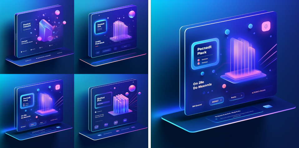
Finished Illustration

Principles of Clarity and Simplicity in Design
The redesign centered around three core principles: clarity in error messaging, simplicity in user flow, and intuitive guidance in password creation. These principles were meticulously integrated into the final UI design, transforming user interactions into seamless experiences.
I translated my concepts into wireframes and interactive prototypes for each of the four flows:
I translated my concepts into wireframes and interactive prototypes for each of the four flows:
Sign up
- Users receive friendly error messages such as "Oops! The passwords you entered don't seem to match. Show Passwords."
- Password input fields provide hints and bulleted requirements, reducing frustration and errors.
Verify Email
- Clear and concise instructions guide users through email verification: "We've sent a verification link to your email. Please click on it to activate your account."
Login
- Friendly error message for incorrect credentials: "Password mismatch! It happens to the best of us. Let's help you reset it."
Forgot Password
- Informative message provides reassurance: "No worries, we’ve got you covered. We’ll send you a reset code shortly. Just enter it on the next page to create a new password."
Figma File
You Can check out the full design for yourself


